
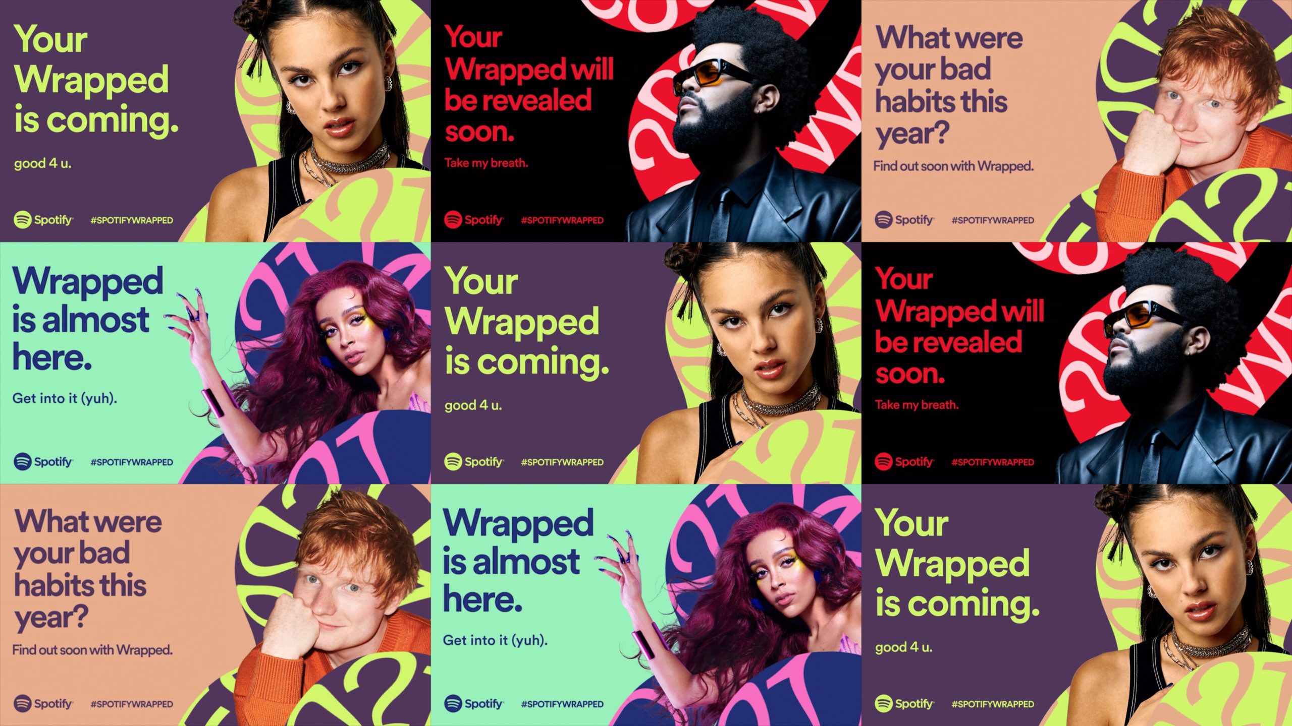
With our friends at Hornet, we built guidelines and a library of toolkit assets to be used on all social and digital experiences.
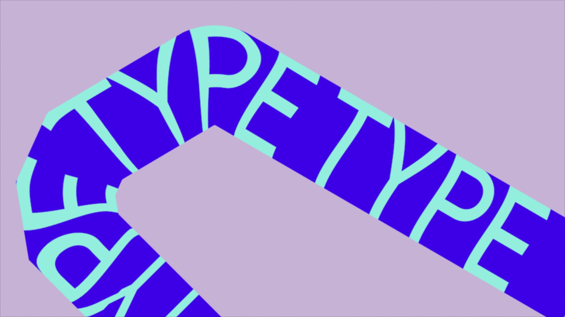
The main device used in this year's visual language was a wild piece of colorful tape. What we refer to as ‘the ribbon’. The ribbon was designed to simulate the look of processed type, something that felt unwieldy - but under the hood, was built to be flexible and customizable.
Type
The ribbon was the primary component to the toolkit, so it had to be robust.
It was created with the ability to enter customizable text and interchangeable symbols across 6 different silhouettes.
Transitions
The toolkit also included:
- In and out transitions for the ribbon,
- flipping and reversing the trajectory of the type, and
- loopable animations at any duration.
Colors
2021 also came with a fresh palette. Four color schemes across the campaign allowed for numerous variations. 24 variations to be exact! All streamlined within our toolkit.
Performance
Special care was taken to ensure the renders were fast and the project was user friendly.
Director
Andrew Vucko
Client
Spotify
Production Co
Hornet
Managing Director
Hana Shimizu
Head of Production
Karen Lawler
Head of Creative Development
Kristin Labriola
Executive Producer
Cathy Kwan
Production Supervisor
Dez Stavracos
Producer
Annalee Walton
Associate Producer
Esteban Cuenca
Senior Editor
Sam Stulin
Assistant Editor
Hyeseung Kim
Technical Directors
- Zack Lovatt
- Ted Wiggin
Motion Lead
Itay Tevel
Designer-Animator
- Fede Cook
- Alma Kim
- Cynthia Larenas
- Lynn Hwirin Park
Sound Company
Skillbard